
Working With Graphics
Graphics should never be for decoration. Instead, they should have a clear purpose and help the reader to understand something in your document that would be difficult to show with text alone. For that reason, you’ll need to take some extra steps to help your audience use the graphic effectively.
Pick The Right Graphic For Your Purpose
Different graphics have different functions, so you should choose one that meets your needs. For example, let’s say that you’ve been asked to write a report recommending whether your company should voluntarily recall a product. You might insert a photo of the damaged product so that your readers can see proof that the damage is extensive. You might also include a diagram of the product to help the reader understand why the malfunction occurs. If you want your reader to understand that the product has been receiving a lot of customer complaints, you might create a bar chart that compares the number of complaints received by your product to those of similar products that you sell.
When selecting a chart, graph or table, you’ll want to pick the one that fits the relationship you’re trying to show. For example, if you wanted to show how something changed over time, you’d use a line graph. If you wanted to compare different numbers, you’ll use a bar graph. If you wanted to show the percentages of a whole, you’d use a pie chart.
This collection of images will help you to see some popular types of charts and graphs. For a version that’s accessible to print documents and screenreaders, the information is also repeated below.
Types of Charts
- Line Graph: Shows how something changed over time. Shows trends.
- Table: Shows a large amount of numerical data, especially when there are many variables.
- Bar Graph: Helps your audience compare numbers, shows how items relate to one another.
- Pie chart: Shows the parts of a whole. Note: only use this when your data adds up to 100%. For example, if you did a survey and allowed participants to choose more than one option, a pie chart wouldn’t be appropriate.
- Checklist: Helps readers understand the steps in a process and keep track of what they have completed.
- Flowchart: Helps readers understand the steps in a process/procedure
- Infographic: Makes a lot of data accessible or entertaining to a general audience.
- Venn Diagram: Shows how different ideas or elements overlap.
- Organizational tree: Shows a hierarchy, such as the structure of an organization.
- Gantt Chart: Shows a project schedule, including what tasks must be completed and when.
Make Your Graphic
Once you understand your audience and the purpose of your graphic, it’s time to create it. Many people create charts in Excel, Word, Google Docs, or a free chart generator. Make sure that you label your chart clearly.
Integrate Your Graphic
You chose your graphic because it shows a relationship, but unless you help your reader out, they might not see the same connection that you see. Insert your graphic close to the text that discusses it, though you should make sure that your graphic fits on one page. For example, if you’ve written a paragraph about how the defective product has three times more customer complaints than similar documents, you would put the bar graph that shows this data directly below.
The first mention of a graphic is called a lead-in statement. It’s also recommended to also use a lead-out statement after the graphic. This is a statement that connects the figure to the material that follows.
Our research shows that the BackScratcher Supreme received three times more complaints than our other backscratchers. This bar graph shows the number of customer complaints we received last quarter for each product.
Figure 12.8: Customer Complaints About Back Scratcher Products [Image Description]
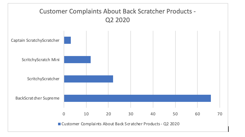
As you can see, no other back scratcher comes close for the number of complaints. This suggests that the matter is systemic, not just a few isolated incidents.
Label The Graphic
Add Alt Text for the Graphic
Cite the Graphic
Just as you would cite and reference a paraphrase or a direct quote, so too must you cite and reference any graphics that you use that were created by someone else or that were based on someone else’s data. Indicate the source of any graphic or data you have borrowed. Whenever you borrow a graphic or data from some other source, document that fact in the figure title using an in-text citation. You should also include the reference information in the reference list.
This reference guide from SFU tells you how to cite graphs, charts, photos and other images in a variety of settings.
Image Description
Figure 12.8 image description:
A horizontal bar graph that compares customer complaints about back scratcher products in Q2 of 2020. Showing that the BackScratcher Supreme had 66 complaints, compared to 22 for ScritchyScratcher, 12 for ScritchyScratch Mini and 3 for Captain ScritchyScratcher. [Return to Figure 12.8]
