Marketing
36 Website

An important tool for an NPO is a website. Some brands opt to exclusively live on social media channels, but utilizing a website to set a brand voice, provide more information about your organization, and allow your target audience to engage with you on a deeper level goes a long way towards building credibility. A website should be one of the first platforms you set up. Building a website can seem intimidating if you don’t know where to start. This guide will help you set up a beginner site for your cause!
Domain Names
It’s recommended that you research domain name availability before deciding on the name for your organization. This ties into the naming exercise in a chapter above, you’ll have wanted to choose a name for your cause that hasn’t been taken yet! Consider having a backup or alternate way of writing your name, or make it geolocated. For example, No Hunger BC is a common name, but having the location in the name differentiates it and signals to the local target audience.
Domain names cost money, but it’s a small investment for a huge impact on your brand and organization.
Here are some good sources for domains, each varies in the price:
- GoDaddy
- Google Domains
- Hover
- SiteGround: WordPress Hosting
Finding a Website Platform
When you sign up with a free website creator, they can provide you with a free domain name too, and that might be your only option (The format of the free Wix site URL is username.wixsite.com/siteaddress[1]). But purchasing the site premium will allow you to add your own domain.
After you’ve established your website name, you’ll want to find a creator platform to develop it. There are a variety of free website providers that have an arrangement of tools, though it’s almost always recommended that you buy a premium account with them.
WebsiteBuilderExpert shares their 7 Best Free Website Builders in 2023. See the post for an in-depth assessment of these sites.
Here are some more website builders to check out:
- Wix: Best All-Around Website Builder.
- Weebly: Ideal for Small Businesses.
- SITE123: Great Design Assistance.
- WordPress: Perfect for Blogging.
- Strikingly: Made for Simple Websites.
- Jimdo: Small Online Store Builder.
- SimpleSite: Great Mobile Editor.
- IM Creator: Great for White Label Businesses.
- Webnode: Quick and Easy Setup.
- Mozello: Create Simple Multilingual Sites.
Be sure once you’ve selected a platform builder for your site, that you get familiar with their tools and features, as not every platform is laid out the same.
Key Pages for a Website
The next step for your site is to consider what content you want to show on your site and how do you want it organized? For starters, drawing out a basic wireframe of your website will help you get an idea of where you want all the info to go.
1. Homepage
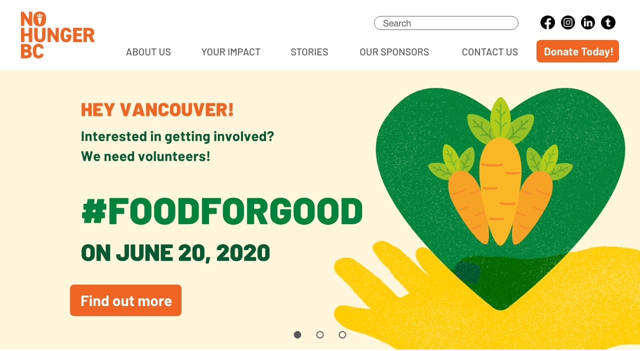
The homepage is your viewers first impression of your site and organization, make use of the space so that it magnifies the key points you want your visitor to know about. This is where you can introduce yourself and your cause, describe your progress and provide opportunities: bring requests for volunteering, donations, and/or sponsorship to the forefront – this is called the “Call to Action” and it’s very important on all marketing platforms, this how you want your visitors to engage with your site, how are you trying to get your visitors involved?
2. About Page
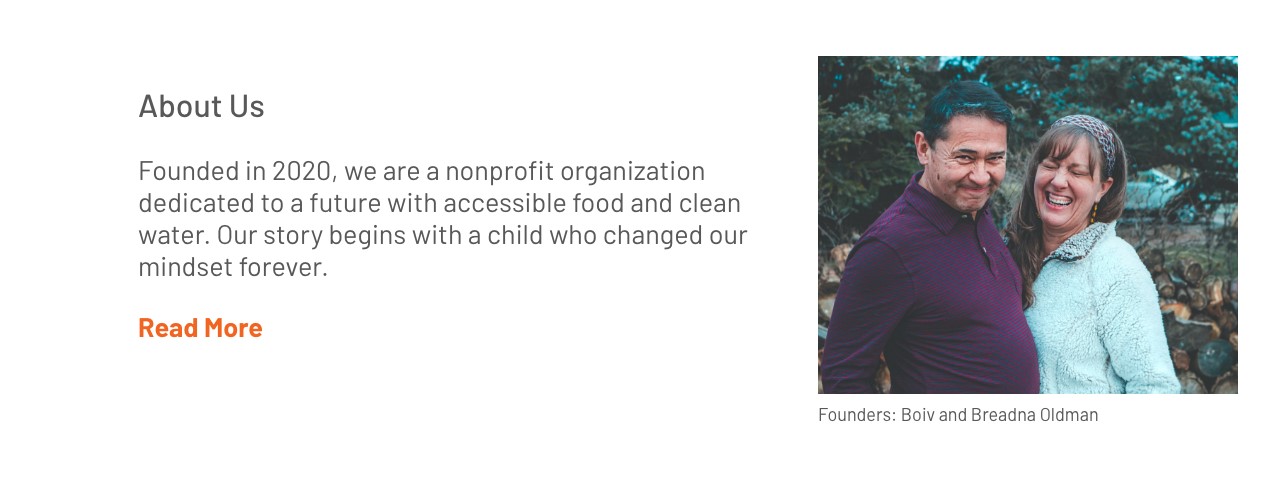
An about page is where you tell your story, letting your visitors get to know you and the organization, when and where were you established, what drew you to this cause, what is the emotional attachment that you have to this cause? This is where you could list your past success and historical moments within your organization.
3. Your Impact
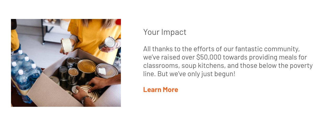
Make the organization about the your supporters and applaud your community for their efforts, encourage and reinforce their generosity with displaying records of their success and charts on their progress. This could be a signature/money metre, the amount of successful distribution of charitable materials, or number of people saved. Anything that symbolizes success, no matter how small, calls for the attention of the organization to praise these efforts, and this is what reinforces continuous charitable support.
4. Resources
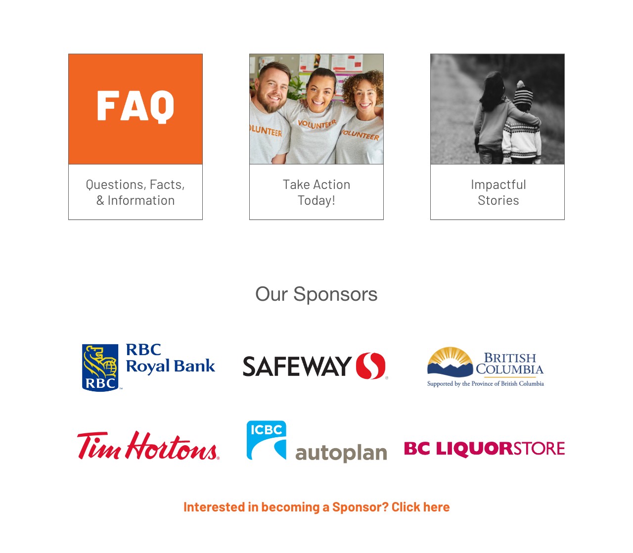
Depending on what you’re promoting, you will need to educate your visitors on the cause. Provide a page for the cold facts and necessary information about your cause so that others can appropriately share your cause with the proper education on the matter. Having more than one source and external links will benefit the solidarity of your cause.
5. Current Activity and Content Feed
Be sure that you have a section that displays what is currently being done by and for your organization. Your audience cares about your engagement just as much as you care for theirs. This can include a feed for your social profiles, articles and blogs, or an active counter for contributions and supporters.
6. Goals and Mission
Describe your intentions, this section is so your viewers have a clear understanding about what your organization stands for. You can list your goals and objectives, and the main mission that drives this cause.
Consider Accessibility
A big factor in marketing to a wide range of audiences is being considerate of any and all differences. A part of inclusivity is considering all forms of inaccessibility.
“Solve for one, extend to many”
— Microsoft | Inclusive Design
This could be a person with a hearing impairment, a senior with partial blindness or someone with mental barriers, the reasons for inaccessibility are circumstantial but can be very prevalent in many commonly known “abled” people’s lives. Websites that lack accessibility can be very unaccommodating and can leave those who need it with fewer options in terms of online contribution. You can help normalize their experience when you consider other methods for completing forms or receiving and understanding content when they are able to make an impact for your organization because you made an impact on their experience, you are creating a strong relationship with your supporters from all categories.
Template!
Here is a resource for you!
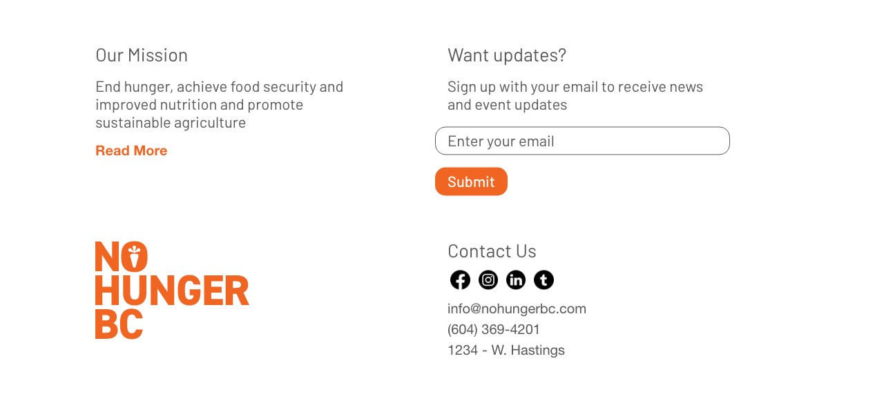
This is a website wireframe based on the homepage example above, with some pointers about what information needs to be included, this will give you an idea on how you can layout your website:
Attribution
This page contains material taken from:
(n.d.). Retrieved from https://support.wix.com/en/article/about-domains#:~:text=A domain is made up of:&text=When a Wix site is,your site at any time.
Carney, L. (2020, June 02). 11 Best Free Website Builders: The Definitive List (May 20). Retrieved from https://www.websitebuilderexpert.com/website-builders/best/free/
Microsoft Design. (n.d.). Retrieved from https://www.microsoft.com/design/inclusive/?autoplay=designforinclusivity
Paris, S. (2020, June 7)
