
Branding
33 Typography

Broadly speaking, typography is arranging text in an engaging, interesting, and legible way. Typography, as part of your organization’s brand, will be visible in many areas including social media, outreach campaigns, posters, emails, etc. So it’s important to consider typography when assembling the putting together the necessary elements of your organization.
Each typeface or font is unique and offers different advantages, therefore it is necessary to categorize them. Sans-serif, serif, slab-serif, and script are just a few of the many sub-genres of typography. When choosing a typeface to represent your organization, not only is it important to consider what a particular typeface says about your brand, but also its availability to use in the formats and mediums that you will require. Furthermore, issues such as legibility, intended audience, and style are all things to keep in mind as they will help dictate your choice of typeface. For simplicity sake, the two main categories of typography, sans-serif and serif are described further below:
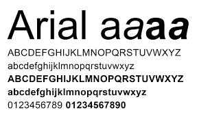
In your brand guide you’ll want to communicate the typefaces you’re using by providing a character set such as the one below for our No Hunger BC example:

If the typeface is not commonly included on most computers (meaning you had to source it externally), you’ll want to link to the typeface online or provide the text file.

Serif Type
Serif typefaces can be categorized as letters with strokes that extend from them, while sans serif typefaces lack these strokes. Serifs are often considered old-fashioned; they look older and are often associated with print media. They are typically known to be easier to read for long-form content such as blogs, books, and newsprint.
Sans-Serif Type
Sans-serif typefaces are typically modern looking. They’re often clean, simple, easy to read on a large scale, and fitting for a lot of modern-day uses. Sans-serif type lacks the strokes seen on serif type instead of relying on simpler forms and geometry.*
Sourcing Typefaces
Although large companies nowadays have the ability to get their own custom typefaces specifically designed for them that is simply not attainable for smaller businesses or nonprofits. Many companies such as Netflix, Airbnb, Apple and Coca Cola have even created their own typefaces in a move to make typography a more considered and unique part of their identity. But if you’re looking for free-to-use or open-source typography places such as Google Fonts, Open Font Library, and Adobe Fonts (formerly Typekit) are all good resources for finding the fonts you’re looking for. These sites offer access to a vast quantity of fonts that are free or low-cost to use even on the web where often a majority of most brands content will likely live.
It’s important to note that typography alone won’t dictate how much attention your design garners. Other factors such as colour choice, imagery, and contrast also have a substantial impact on the overall feel and the impact your design will achieve. It’s important to consider what your goal is with any project and if the typeface you chose will help you achieve your desired outcomes.*
Fonts
The design doesn’t stop at the picture. Fonts have everything to do with your audience’s engagement with your communication.
Take a look at this font and decide if it’s easy to read:

You can tell what it says; however, reading this font for too long could get taxing, especially on a screen.
Is this next font easier to read?
 Your audience won’t continue to read your communication if you’ve chosen a font that’s difficult to read.
In addition to legibility, there’s a question of style. How do you feel about these lines of text and how they work together?

They’re just words, but they’re very visual; the use of colour and different fonts draws your attention to the words “dream it” and “do it.”
Continued Learning
If you would like to expand your learning on Typography please reference the links below! It gives an overview of common types of fonts, how to use them and how to choose the right font for your brand.
- YouTube Video – Beginning Graphic Design: Typography
- Video Creator’s website that contains more information.
Attributions:
This page contains material taken from:
“Business Communication Skills for Managers.” Lumen, courses.lumenlearning.com/wm-businesscommunicationmgrs/chapter/visual-design-principles-overview/.
Willis, N. (2018, March 6). Exploring free and open web fonts. Opensource.Com. https://opensource.com/article/18/3/webfonts
Goodwill Community Foundation. (2016). Beginning Graphic Design – Typography [Video]. GCFLearnFree.org. https://www.youtube.com/watch?v=sByzHoiYFX0&feature=youtu.be
