
Branding
30 Mark/Logo
Developing a Mark for Your Brand/Campaign
Marketers rely on branding to associate aspirations, attributes and values with functional products and services. The resulting relationships mean target audiences are drawn to the offer as much for its symbolic value as for its utility (Aaker, 1997)(van Osselaer & Janiszewski, 2001). Repeated pairing of branded collateral with positive contexts, colours and symbols create favourable and brand-specific connotations, to the point where a brand alone eventually evokes those associations and the benefits assumed to follow (Nord & Peter, 1980).
Consumers use physical brand attributes to construct imagery that they draw on and personalize; ultimately, brands help consumers to co-create an identity they project to others (Belk et al., 1982). Known as symbolic consumption, this process involves consumers forming relationships with brands, which they use to structure and create meaning in their lives (Gendall et al., 2012).
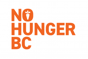
In developing a mark for No Hunger BC, boldness and repeatability were key considerations. Primarily typographic logos offer a level of urgency and flexibility that can be beneficial for non-profit brands and campaigns. No Hunger BC is a food bank organization with a fresh food program, which is why the carrot icon was introduced to the wordmark. Even simple marks can convey a brand’s story and goals.
Logo Variations
Once a mark has been developed, you need to set up a set of brand guidelines that explains how the mark should be used in a variety of contexts. It’s a place to present the logo for you brand or campaign along with it’s variations. It’s helpful to create links to download the logo file so other members of your team can also access it. Files recommended are .jpg and .png files, as well as a .svg file which allows the mark to be opened and scaled as a vector.
Primary Logo
Download Link:
.png
.jpg
.svg
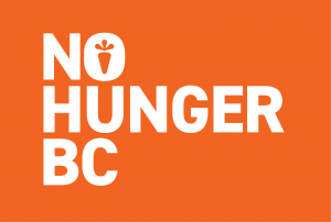
Reversed (White)
Download Link:
.png
.jpg
.svg
In some cases, you will utilize multiple iterations of a logo for different contexts. It’s important to also provide the files for those versions so your brand is presented the way you envisioned it.
In the below example, No Hunger BC created a secondary application of the logo to more prominently display their icon, which could be used for social media or other web/small scale applications. Download links are also provided for these files.
Icon with Wordmark
![]()
Download Link:
.png
.jpg
.svg
Reversed (White)
![]()
Download Link:
.png
.jpg
.svg
If you have more iterations of your logo, you can continue to list them. Just be sure that you’re clear on the contexts they’re supposed to be used in and what the limitations are.
The below example is a horizontal application that could be utilized when design space is limited, such as footers, web banners and posters.
Horizontal Application

Download Link:
.png
.jpg
.svg
Reversed (White)

Download Link:
.png
.jpg
.svg
Brand Guidelines
Once you have given your team access to the brand mark, it’s important to provide context on how that mark should be applied. Logo usage guidelines might include the minimum clear space necessary around a logo, guidelines for presenting the logo alongside corporate partners, as well as rules against skewing or rearranging the logo which can damage brand continuity. But really, there are a number of different guidelines a set of brand standards could display. It’s important to look at the nature of your NPO and brainstorm how your branding might live in the world.
Below is an example set of guidelines for No Hunger BC based on the needs of their organization.
Logo Usage Guidelines
![]()
Don’t Change Colour
In most cases, it’s important for the colour of the logo to stay the same to promote continuity. For No Hunger BC, they only use one colour for the logo, and it must always remain the same. The only exception is when the logo is reversed onto the specified orange background, in that case it becomes white.
Don’t Fill the Icon
The carrot icon is the defining mark of the brand, so it must never be filled in. In cases where the mark is going to be presented small enough so that detail of the carrot may be hard to make out, an alternative has been specified in the brand guidelines that incorporates a larger icon.
Don’t Condense to Two Lines
No Hunger BC has specified that the amount of lines the wordmark can take up is either 3 or 1. Anything other than that breaks the brand guidelines.
Clear Space
Clear space is the specified area around the logo that must be kept free of additional text or other graphic elements. It gives the logo the visual hierarchy it needs, and doesn’t allow the branding to be confused or cluttered.
Social Media Icon
Since social media icons predominantly appear very small on the interfaces they are displayed on, it’s important to have a mark that communicates on such a small scale. In this case, No Hunger BC utilizes their carrot icon for all their social media branding.
Attributions:
This page contains material taken from:
Aaker, J. L. (1997). Dimensions of brand personality. Journal of Marketing Research, 34(3), 347–356. JSTOR. https://doi.org/10.2307/3151897
Belk, R. W., Bahn, K. D., & Mayer, R. N. (1982). Developmental recognition of consumption symbolism. Journal of Consumer Research, 9(1), 4–17. https://doi.org/10.1086/208892
Gendall, P., Hoek, J., Edwards, R., & McCool, J. (2012). A cross-sectional analysis of how young adults perceive tobacco brands: Implications for FCTC signatories. BMC Public Health, 12(1), 796. https://doi.org/10.1186/1471-2458-12-796
Nord, W. R., & Peter, J. P. (1980). A behavior modification perspective on marketing. Journal of Marketing, 44(2), 36–47. JSTOR. https://doi.org/10.2307/1249975
van Osselaer, S. M. J., & Janiszewski, C. (2001). Two ways of learning brand associations. Journal of Consumer Research, 28(2), 202–223. https://doi.org/10.1086/322898
