IMC Guide in Action
59 Campaign Material
Creative Brief
The creative brief should be straight-forward for your designer or design team to read. It should not be designed heavily to eliminate bias and personal preferences in the design decision-making process. Here is a direct link to an amazing creative brief example.
Brand Guidelines
Primary Logo

The Surrey Breakfast Club identity is inspired by establishing the SBC as a leader and supportive community in educating children and their families about healthy eating. In the symbolism of the brand identity, the egg represents SBC as a growing supportive community for healthy eating and the toast/school represents the outcome of healthy eating, a better education. To keep the identity playful and friendly, the egg also has a smile to encourage children and parents to join the SBC in living healthier lives.
Reverse Colour

Black-and-White versions


Horizontal Logo

The Surrey Breakfast Club’s secondary application of the logo (horizontal) is used for applications where the primary logo is not appropriate or can’t be used as effectively i.e. banners.
Reverse color and black-and-white versions


Surrey Breakfast Club Icons

Icon usage is best used for smaller applications like social media profile pictures and for applications where the name, “Surrey Breakfast Club” will be present. For example, on Instagram, the handle @surreybreakfastclub will always be present beside your profile picture. Therefore, there is no need to repeat SBC in the profile picture.
Reverse color and black-and-white versions



Visual Identity: Campaign Posters
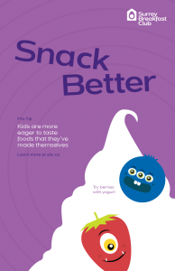
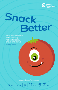
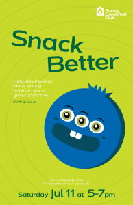
The SBC’s campaign to promote the “Better Snacking” program will consist of four event posters. Three of the posters represent SBC’s commitment to “[helping] kids develop better eating habits to learn, grown, and thrive.” To incorporate SBC’s brand personality as “fresh, imaginative, bold, and adventurous,” the spokespeople for Surrey Breakfast Club are friendly fruity monsters. It can be difficult to persuade children and families to change eating behaviors, so presenting healthy eating as fun, easygoing, attainable will catch the eyes of SBC’s audience over the expected photograph of a garden.
Using a bright, friendly color palette, it is best to use the primary white logo of the Surrey Breakfast Club for this context.
Target Audience

The primary audience for Surrey Breakfast Club is teachers, educators, and counselors in the Surrey community who are active allies. The secondary audiences include parents of low-income and marginalized families and outspoken parents who are key leaders in the community.
