
11 The Conversion Funnel
When the online purchasing process is broken down into several smaller steps, we call these micro conversions. Analyzing each step is critical to understanding where problems in the conversion process may lie.
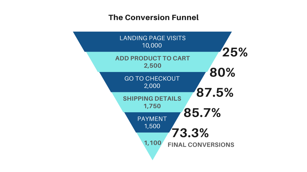
Visually, the conversion funnel is displayed as an actual funnel showing the largest numbers at the time (e.g., site or landing page visits) and the smaller number at the bottom (e.g., final conversions, transactions, sales, or purchases).
In the above scenario, we have a fictional online retailer who receives 10,000 visits to a landing page – let’s say, a product landing page of some kind. Some of those visitors (2,500) proceed to put the product in their shopping cart while the others (7,500) leave the site; we don’t count those in our conversion funnel calculations.
Next, out of those 2,500 visitors who added the product to their shopping cart, 2,000 of them decided to carry on to checkout. Of those 2,000 who went to checkout, 1,750 decided to add their shipping information and then of those 1,750, there were 1,500 who felt ready to add their payment information. Out of those 1,500 who added their payment information, 1,100 clicked to confirm their purchase which makes up the final conversion count.
Conversions are calculations as a ratio, so for each step we divide the smaller number by the larger number then multiply by 100 to make it a percentage. So in our funnel we see the following micro conversion rates, from top to bottom.
- 25%
- 80%
- 87.5%
- 85.7%
- 73.3%
Analyzing the conversion funnel
How can the information in our conversion funnel help us make better decisions? In this example, we can see that the very first micro conversions, where a portion of our visitors are putting the product in their shopping cart (25%), is significantly lower than all the other steps of the purchasing process.
As a marketer, I would want to go an examine the conversion activity on my landing page and determine how to improve upon it so I can increase the number of conversions at this step. It may be as simple as changing the word “cart” to “basket” or switching the button colour from red to blue. Fortunately, you can test any changes that you do make – collect the data, then compare, and see which version of your landing page performed better.
