4 Results Section- Figures
4.1 Presentation of Data in Figures
In the Results section of a lab report the most common types of figures used are graphs (line graphs, bar graphs, and/or scatter plots) generated in software like Excel. However, biological illustrations, photos, maps, and diagrams are also considered figures and must be formatted in the same fashion. Figures must be embedded within the document and left-justified. Like tables, you want to keep the caption and figure on one page.
Illustrations are typically drawn on a computer using drawing applications/tools in Word, PowerPoint, Adobe Illustrator, etc. ideally for a professional look. As a last resort, well-drawn images by hand may be considered acceptable. Use of drawing applications/tools as well as the ability to create hand-drawn biological drawings are important skills to learn at this point in your undergraduate education as they are employable skills.
The size of the figures on the page matters. It must be large enough for the image, labels, data, and trends to be legible. Typically we recommend figures be approximately 1/2 of a page in size depending on their content. See Appendix B in the lab manual for details on how to do proper biological drawings.
Remember, like tables, all figures must be referred to in the text of the Results section of your lab report (See example below).
It is important to note that you should never include a graph “title” at the top of your graph even though it is set as a default in Excel software when you are creating the graph. That title in Excel does not follow APA Style rules for figures. A well-written figure title should be sufficient, and any extra information can be included below the figure in the note section (See Figure 2).
Figure Activities
In Figure 2 below, a graph was generated using the data from Table 3 in the previous chapter. You can click on the Hotspots on the figure to read the descriptions regarding the features of the figure to learn more about the APA Style format for figures. Note, to expand the image to full screen you can click on the expand button on the top right corner of the image.
In Figure 3, an illustration, below you can click on the Hotspots on the figure to read the descriptions regarding the features of the illustration to learn more about the appropriate presentation of figures which are illustrations based on APA Style rules. Note, to expand the image to full screen you can click on the expand button on the top right corner of the image.
4.2 Experimental Controls and When to Graph Them
What is a scientific control?
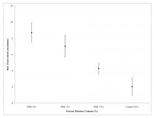
A scientific control is designed to minimize the effects of variables other than the independent variable (the one we are manipulating). It is a treatment that assesses all other variables (apparatus, chemicals present, etc.) to determine if any of them are influencing the experimental results. By using controls in experiments a scientist increases the reliability of the experimental results. This is often done through a comparison between a control treatment and the other treatment(s) where the independent variable is present. See the example in Figure 2.
Figure 4
Mean rate of movement (cm/minute) of L. rubellus in soils with different percent moisture contents
 Note. The error bars indicate the 95% confidence intervals of the sample mean, n=20.
Do I include the control data in a figure that is a graph?
If a treatment is being directly compared to the control group like in the Biology 1110 Blackworm lab measuring pulse rate, then yes, you graph the control. Blackworms have a pulse rate even without the treatment, and the purpose of the lab is to determine if the treatment alters the pulse rate or not.
If the control influences the outcome of the experiment due to experimental design (e.g., the experiment is run in a vacuum system), then the effect of the experimental apparatus used MUST be subtracted from the other treatment(s) where the independent variable is present. This allows us to account for the effects of the constant variables in the experimental design. In this scenario, you adjust your experimental raw data to account for the effects of the control before doing any data analysis so the outcome of the control treatment is factored in before the data analysis (often referred to as adjusted data). That means you DO NOT graph the control. To better understand this review of the experimental design and raw data below then view the data.
Example of When to Subtract Control From Each of the Treatments
Experiment Design:
To test the germination rate of tomato (Solanum lycopersicum) seeds, 50 seeds per treatment were planted individually in dry soil 1-2 cm below the soil surface in 2-inch planter pots and placed in a temperature (20°C) and light-controlled greenhouse (10 hrs light per day). The pots containing the seeds were then watered daily with 7 treatments of varying water volumes (mL). The treatments were 2, 4, 6, 8, 10, 12, and 14 mL of water per day for 7 days. A control treatment was also set up that got no water during the 7 days.
Raw data:
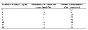
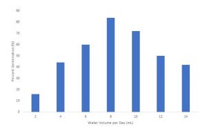
Table 4 provides the raw data collected. During the experiment surprisingly 2 seeds managed to germinate in the control without any watering. This may be due to the humidity of the greenhouse they were grown in. Since there was germination in the control treatment, we must assume that all the other treatments may have 2 seeds germinate even without watering therefore we must subtract 2 “control” seeds from each of the other treatments to obtain an adjusted germination rate over 7 days. A graph of this adjusted data in percentage (%) is shown in Figure 5.


